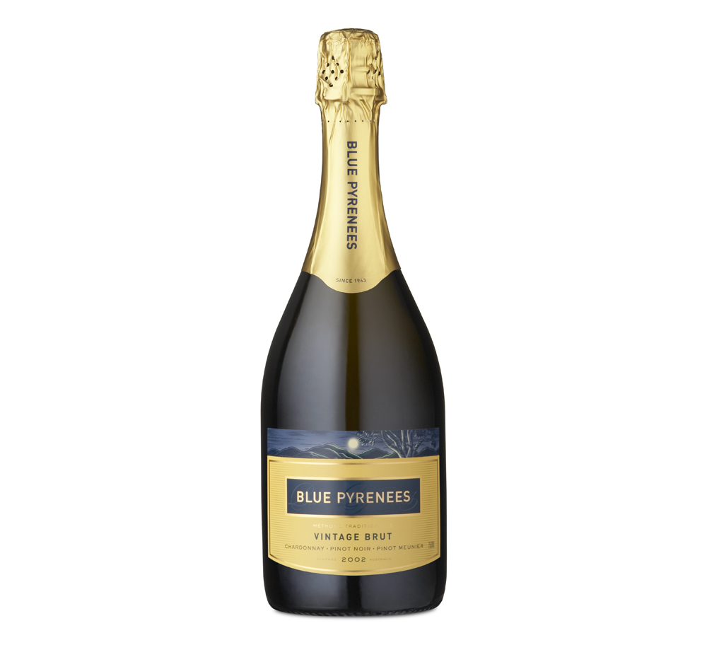
Blue Pyrenees needed a complete packaging refresh. It was decided to retain two key elements from the original packaging: an image of the hills and vineyard in the moonlight and a distinctive yellow for the label on their hero Vintage Brut.
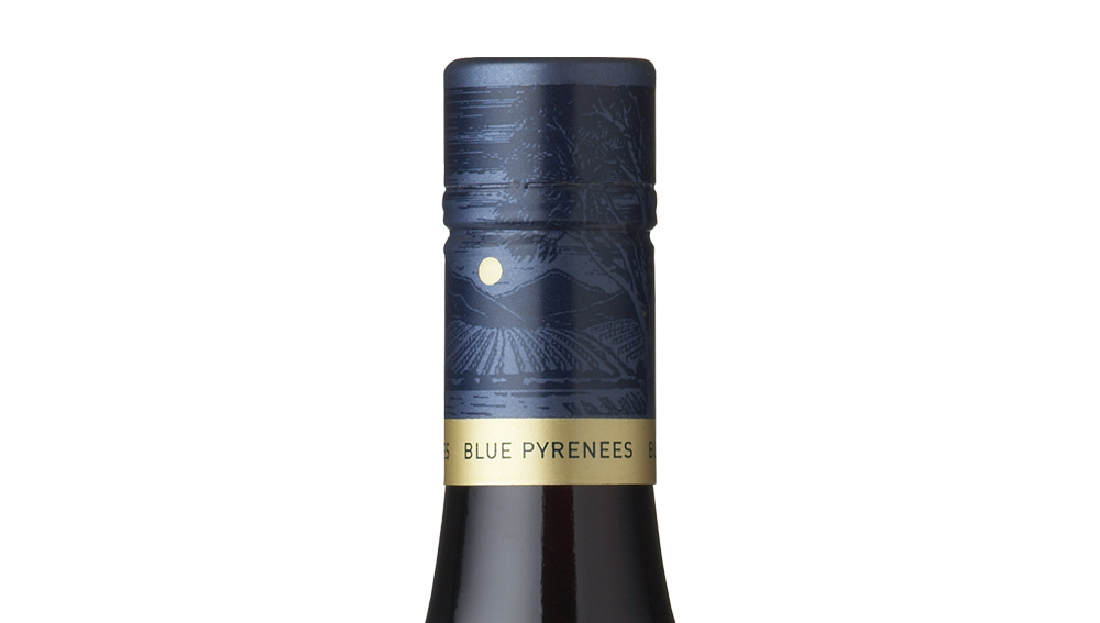
A new logo and monogram in blue and gold was designed to strengthen and enhance the brand name on packaging.
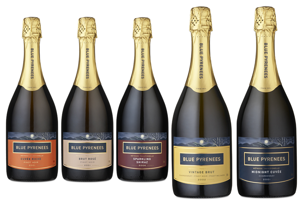
The vineyard image was redrawn with flexibility and printing effects in mind. For example a narrow band of the illustration adds interest and texture on the sparkling range, while the full illustration creates a wraparound image on caps for table wines. The Yellow label on the Flagship Vintage Brut was retained and became the basis for a range of sparkling wines with colour coded labels.
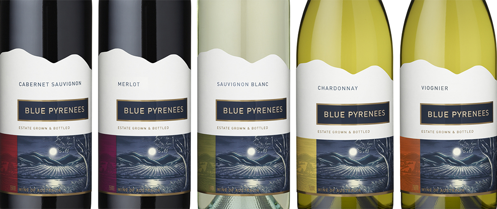
The Blue Pyrenees range of table wines feature the full illustration with linework and details embellished in raised gloss varnish. The client wanted interesting shaped labels, so the horizon line of hills in illustration was used to define the top edge of labels creating a distinctive, memorable silhouette.
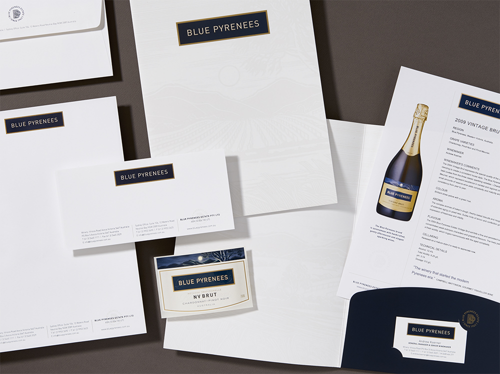
A complete range of business stationery including presentation folder with vineyard illustration printed in a subtle watermark effect was designed. Templates in Word were created to allow wine tasting note sheets to be updated by winery, in-house.
