• Home
  • Portfolio
  • About
  • Contact
Stephanie Martin Design

BE SEEN

Graphic design is the way your product or service gets the attention of your market. Effective graphic design solutions will resonate with your customers, elevate your brand, help deliver your vision and communicate your message.

Portfolio

LA ROSA WINE BAR AND OSTERIA

BROWN BROTHERS 125 YEARS SPECIAL RELEASE

BURRANGONG RIDGE WINES

The label design combines the B and the R of the brand name with a streak / flecks of gold. The textured timber background relates to the product name Timbercutter Shiraz

CRAIGMOOR WINES

Craigmoor Cellar Hand

BROWN BROTHERS 125 YEARS SPECIAL RELEASE CELLAR DOOR

AICC COLLATERAL

The Australia-Israel Chamber of Commerce is one of Australia’s leading business networking and thought leadership forums, linking Australian businesses with the extraordinary tech start-up culture of Israel’s innovation economy. Using forms derived from the existing Logo, a triangular matrix was devised to create a framework for supporting imagery. This adds energy and dynamism to the branding as well as being a flexible system that allows variation across a range of pieces.

CRAIGMOOR ESTATE COLLECTION

Craigmoor_Artist Series Range

18eightynine

EighteenEightyNine

BLUE PYRENEES ESTATE

EGGZI

The simple, black, white and yellow colourscheme with black and white photography on the pouch adds credibility. The full colour labels convey appetite appeal and provide product differentiation. Generic pouches in 2 sizes are labelled to create the full range of products including Chefs’ Whole Eggs, Chefs’ Egg Yolks, Bartenders’ Egg Whites, with more products, such as Dessert Egg Whites, to be added to the mix shortly.

PIRIE

The original Pirie Sparkling label was quite small and branding was too quiet compared to the competition. It was decided to increase the size of the label and refresh the colours and finishes. Over time a range of variants has been created: Non Vintage, Vintage Brut, Blanc de Blancs and Rosé. The result is a refreshed look that is true to its roots but has more presence and vibrancy.

COGNIAN TECHNOLOGIES

Cognian Technologies is a fast-growing Australian technology company with a mission to make every building a smart building. The distinctive C Logo made from overlapping planes alludes to the built landscape but with an added twist - an optical illusion effect - that speaks to the innovative, disruptive technologies of the future. The colour palette of greys with bright acid yellow-green is modern and technical with a dash of illumination - lighting being a principle aspect of smart building transformation using Syncromesh technology, developed by Cognian.

jac wagyu

FREEMAN VINEYARDS

SYNCROMESH

Syncromesh is a wireless technology platform for smart buildings. The logo includes interconnecting rings that refer to wi-fi, within a stylised S that can be simplified to allow for small application on products that utilise the technology or as an icon on plans and drawings. The Syncromesh branding uses the same acid yellow green to tie-in with parent company Cognian Technologies.

STAMINADE

ALTO OLIVES

Alto Olive Oil

SANDY OLDHAM PEOPLE

Sandy Oldham Pearl

STERIC

BROWN BROTHERS MOSCATO GOLD

YESHIVAH-BETH RIVKAH LIGHTING THE WAY

Yeshivah-Beth Rivkah Colleges required design collateral for a fundraising event. A concept was developed - Lighting the Way - based on the concept of education and the Torah as a guiding light. The symbol itself is a reference to the Ner Tamid a continuously burning lamp, which is situated above the Ark in the synagogue. The colourful patterning. and angles mimic beams of light projecting and reflecting and are reminiscent of modern stained glass. The rich coloured panels next to white made for a fresh, clean vivid look and feel.

MAX COACHING

Max Coaching assists people with career transition. Working with individuals and organisations they have a unique system of helping people identify new career directions and supporting them through transition to new jobs and new horizons. Max Coaching wanted the business to look approachable, dynamic and engaging. Definitely not serious stuffy and boring. The colour orange from the previous logo was retained and the step-by-step nature of the process was developed into a graphic style for use on collateral. The addition of a palette of supporting colours with black has created a strong house style for the brand.

STUDIO PETRINA MILAS

NRL WELFARE & EDUCATION

Stephanie Martin

HELLO & WELCOME

ABOUT

My name is Stephanie Martin. I am an experienced graphic designer with specialist experience in branding, packaging and print media. I am based in Sydney, but work with clients around Australia.

After establishing my career in advertising agencies and graphic design studios I opened my own business in 2005 and have been assisting clients to achieve their goals ever since.

JUST THE RIGHT SIZE

Being a small outfit makes me efficient, reliable and cost-effective. It is easier to establish a relationship with a client and less opportunity for missed communication. I work with other specialists such as illustrators, photographers, copywriters and web developers to provide the right team for your project.

LOOKING GOOD

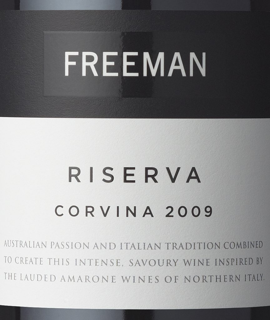
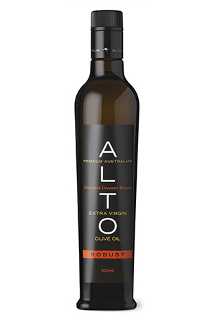
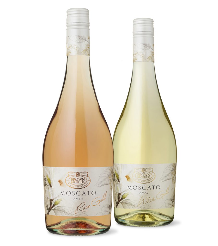
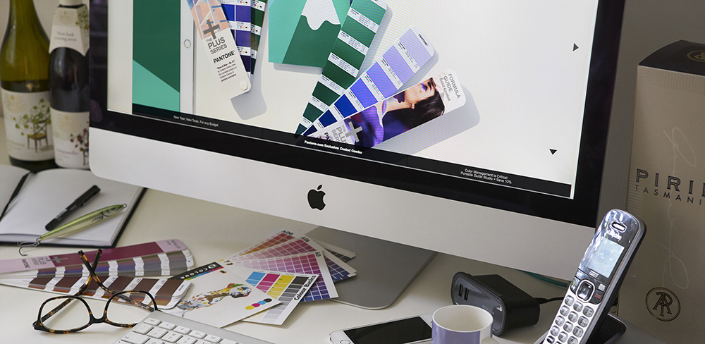
Whether it be a new branding exercise, brand refresh or evolution I can help hone communication and provide tailored creative solutions that will make your brand stand out and have a positive impact on your business. Big or small – every project should look good and work hard.

Desktop


GETTING IT ALL TOGETHER

I work with clients to gain insights into their business and graphic design needs and to develop the brief and scope of the job. Sometimes we meet in person but a lot is done over the phone and via email, so while we are working together on a project it doesn’t matter if we are in different parts of the country. I bring a fresh set of eyes to client’s design and communication problems. This helps to free-up thinking and allows projects to move onto the next stage, when they may have been bogged down.

Here are a few comments from people that I have worked with.

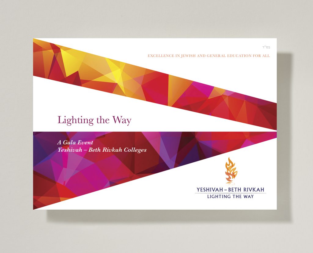
“For your excellence, reliability, professionalism, great sense of humour and absoloutely wonderful disposition – I couldn’t be more grateful! Thank you sincerely for a great experience in branding and creating what was an outstanding event.”

Maureen Barten,
Foundation Manager, Yeshivah Centre

“I have had the pleasure of working with Stephanie since 2012, and am pleased to recommend her highly to anyone seeking a highly creative designer with an incredible eye for detail. Stephanie’s background in advertising means she brings more than design skills to a project, she offers a lot around strategy, content and audience targeting. She understands the job from every angle, bringing valuable input to strategy, content and audience targeting, which has meant our projects have even more impact than first envisioned.”
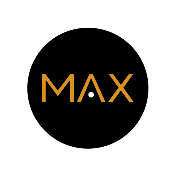
Jane Lowder,
Managing Director, Max Coaching

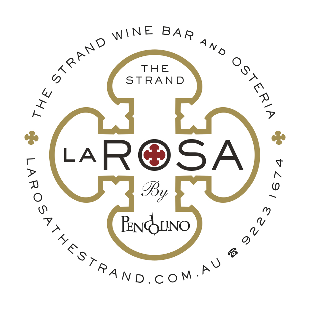
“Stephanie designed the logo for La Rosa The Strand, as well as all collateral materials. Her work was very creative and she provided lots of wonderful designs that made it hard to choose from as they all had great potential. We found Stephanie a great pleasure to work with and would highly recommend her to any business looking for unique and original design work.”

Nino Zoccali
Executive Chef and Owner, La Rosa The Strand

Get in touch

I'd love to hear from you

    stephaniemartindesign

    The Artists Series is the premium wine range from The Artists Series is the premium wine range from Craigmoor. Leading Australian artist Leonie Barton, was commissioned to create a series of works in her “ephemerals” style in response to the vineyards and Craigmoor location. Each label features a unique, abstract, intriguing image that establishes a sophisticated sense of place for Craigmoor Wines in Mudgee.
#winepackagingdesign
    C1858 - Craigmoor is the oldest Cellar Door in Mud C1858 - Craigmoor is the oldest Cellar Door in Mudgee. This shorthand version of the logo reinforces the historical aspects of the footnotes range.
#winepackagingdesign
#branding
    Cellar Hand one of the Craigmoor footnote range - Cellar Hand one of the Craigmoor footnote range - celebrating stories from the rich winemaking and social history of the Mudgee wine region.
#winepackagingdesign
    So Long 2020. Designer Xmas card. Photography by K So Long 2020. Designer Xmas card.
Photography by Keith Arnold. Design by Stephanie Martin. 
#xmascarddesign
    Strada del Bacco label design for house wines at L Strada del Bacco label design for house wines at La Rosa and The Restaurant Pendolino in the Strand Arcade.
#winepackagingdesign
    La Rosa restaurant branding. #brandingdesign La Rosa restaurant branding.
#brandingdesign
    18 Eighty Nine - wine range logo for Brown Brother 18 Eighty Nine - wine range logo for Brown Brothers.
#logodesign
    Brown Brothers 125 Years Limited Release Range - d Brown Brothers 125 Years Limited Release Range - detail of sparkling label.
#winepackagingdesign
    Load More… Follow on Instagram

    CALL
    02 9419 6762

    EMAIL
    stephanie@stephaniemartindesign.com.au


    Stephanie Martin Design

    Copyright 2025 Stephanie Martin Design