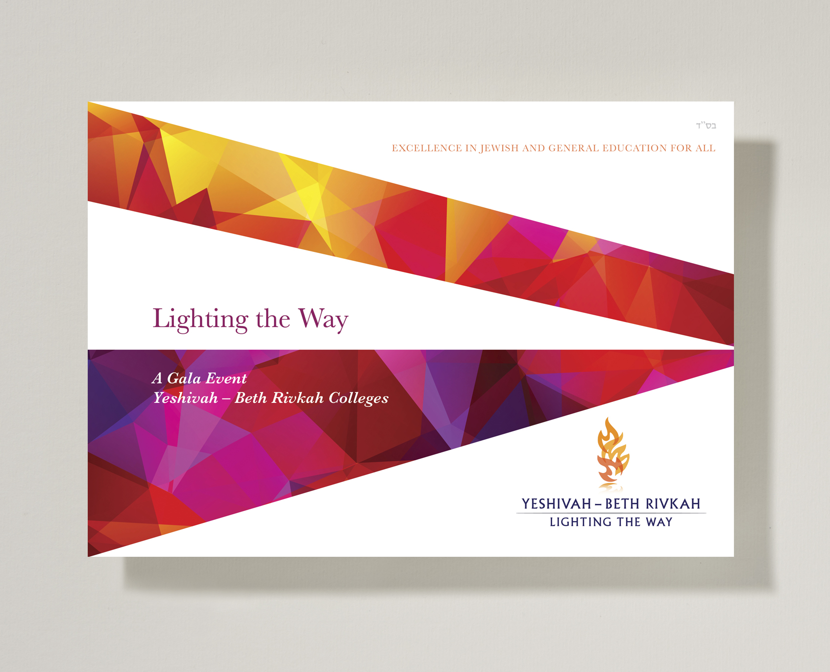
Yeshivah-Beth Rivkah Colleges required design collateral for a fundraising event. A concept was developed – Lighting the Way – based on the concept of education and the Torah as a guiding light. The symbol itself is a reference to the Ner Tamid a continuously burning lamp, which is situated above the Ark in the synagogue. The colourful patterning and angles mimic beams of light projecting and reflecting and are reminiscent of modern stained glass. The rich coloured panels next to white made for a fresh, clean vivid look and feel.
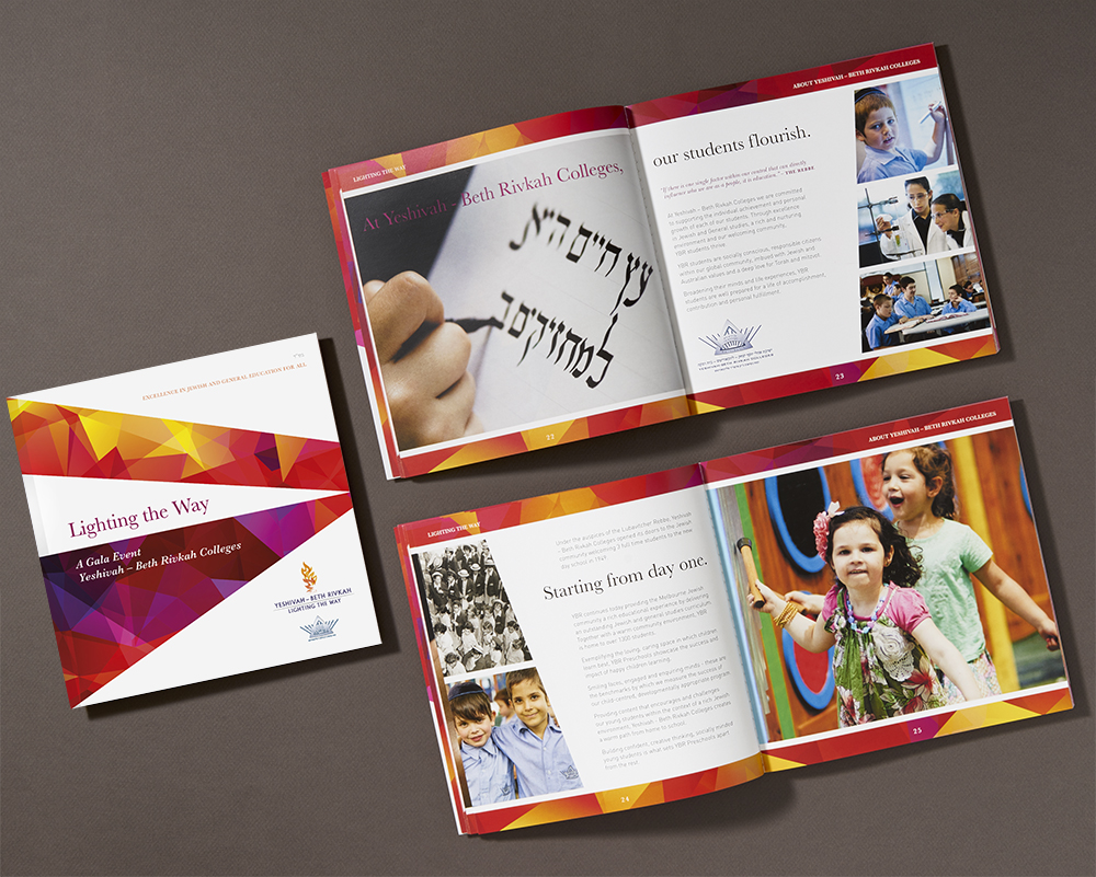
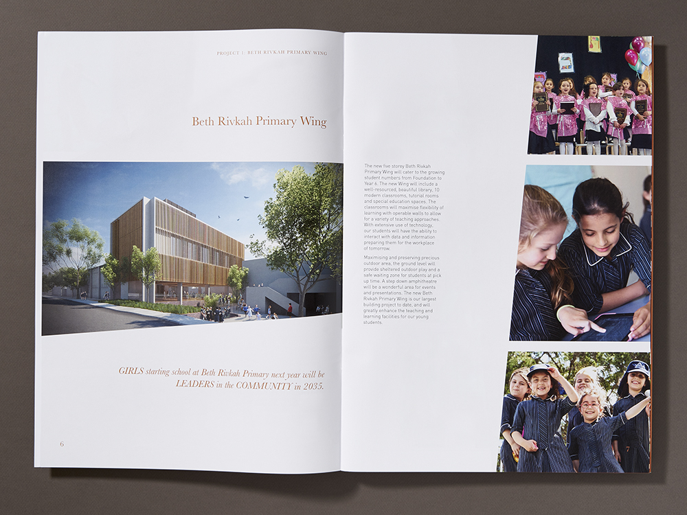
An A3 brochure was designed to introduce the fundraising imitative and outline the various planned projects, prior to the event. Angled photographs and architectural renderings and extensive use of white on the large pages are impactful. Use of a rich copper colour complements the logo.
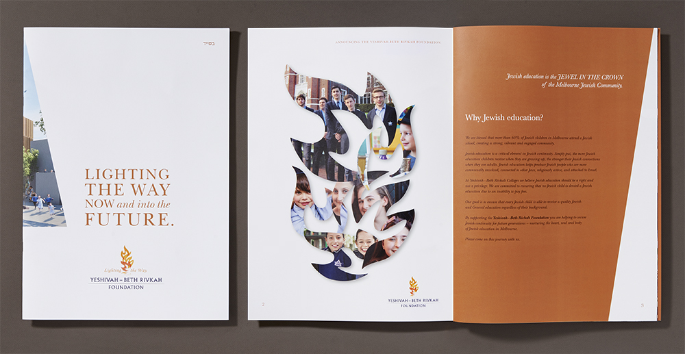
The flame shapes in the logo were used to create a montage of the various pre-school, primary and secondary colleges that make up the Yeshivah Centre.
The design for this brochure and written content were developed hand-in-hand with the design giving structure and key communication points that were fleshed out in more detail by client.