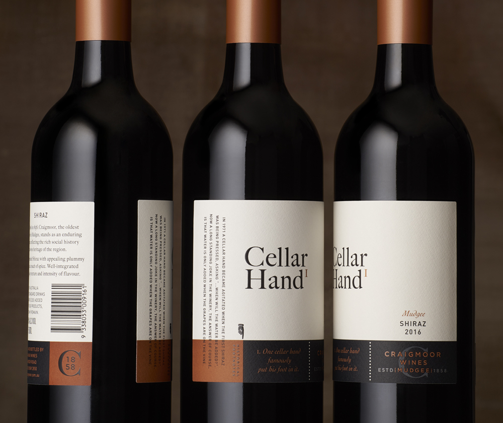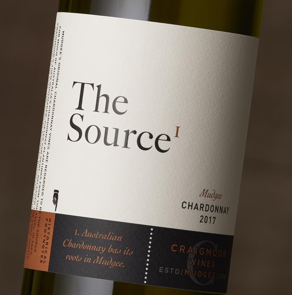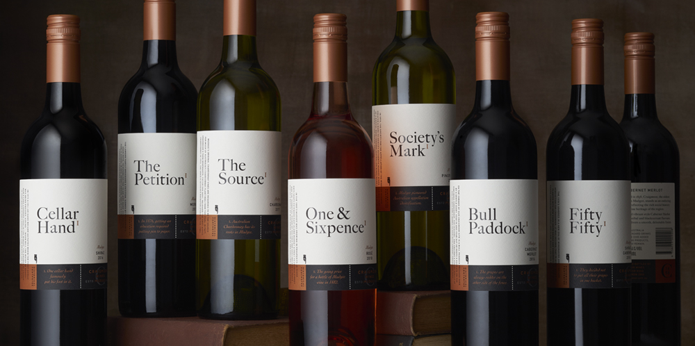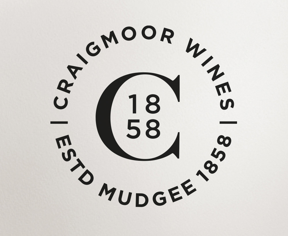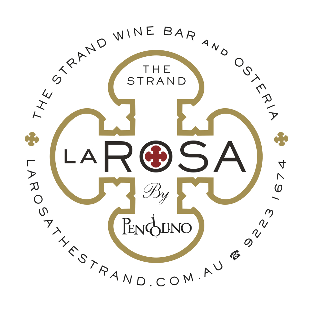
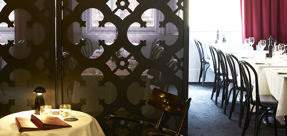
La Rosa Wine Bar and Osteria in the Strand Arcade is the sister to The Restaurant Pendolino, both owned by Nino Zoccali. Nino wanted a logo inspired by the moody interior with a sacred art feel. The decorative fabricated metal screens in the interior provided the perfect shape and with a simple colour palette of black, red and gold two logos were developed. A decorative roundel above expands the religious theme and an elegant typographic treatment below is the simplified form.
![]()
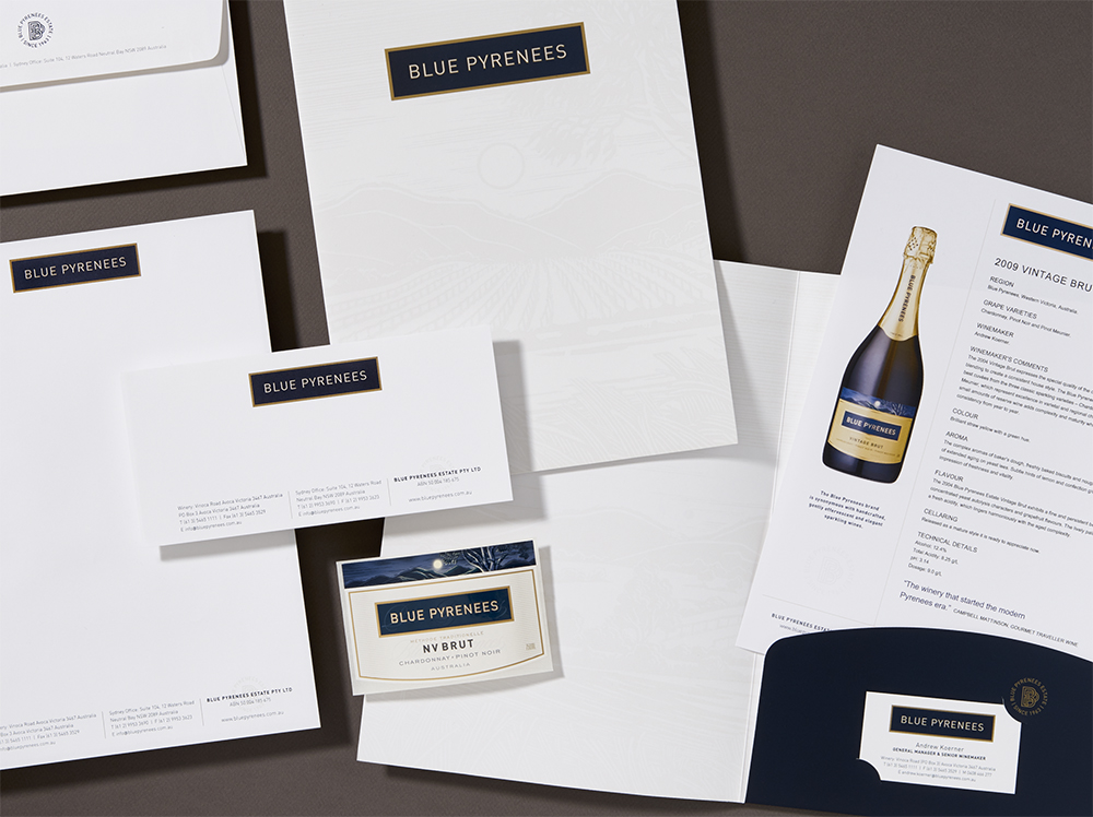
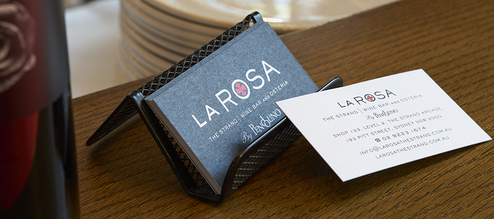
Application of the branding has been applied to business cards, coasters, menus, uniforms, signage, packaging as required.
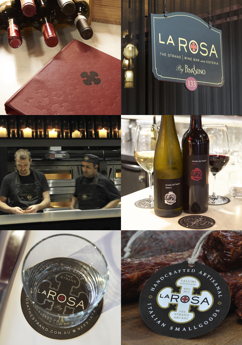
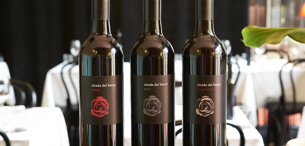
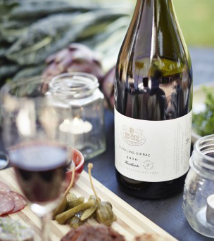
The restaurant offers a range of Italian style house wines that carry on the rose theme using a photographic rose in various colourways. The labels were developed with Nino Zoccali and Cristian Casarin, Group Sommelier.