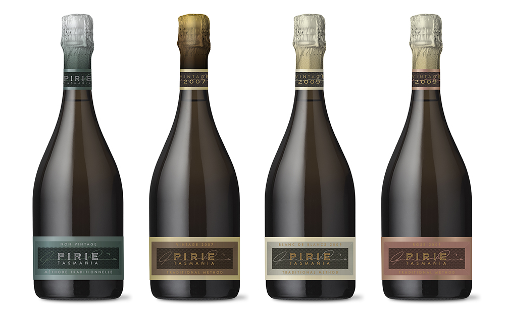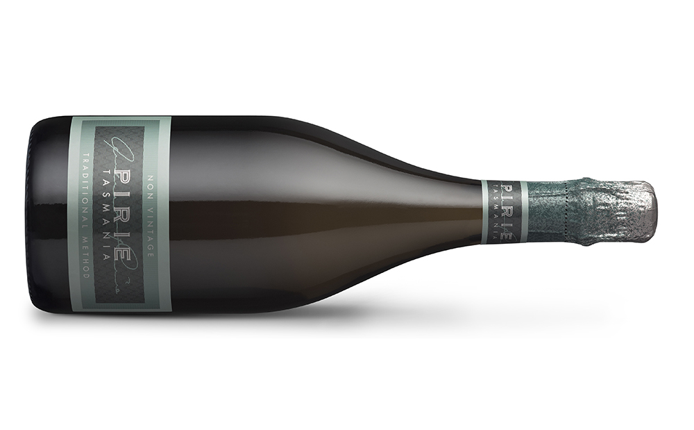
The original Pirie Sparkling label was quite small and branding was too quiet compared to the competition. It was decided to increase the size of the label and refresh the colours and finishes. Over time a range of variants has been created: Non Vintage, Vintage Brut, Blanc de Blancs and Rosé. The result is a refreshed look that is true to its roots but has more presence and vibrancy.